Fixing Foundations: How I restructured SourceAudio to be more intuitive for admins, new and old
Updated April 16, 2026
For over a decade, SourceAudio has been adding features, expanding its reach, and growing alongside the music licensing industry. While our toolset has proven valuable to our client base, it’s important to acknowledge weaknesses that have resulted from years of development without a proper UX strategy.
Previously, new features were layered onto the product without considering how they fit together each time. The result was an admin experience that was powerful in theory, but has been difficult to navigate in practice.
The Problem
SourceAudio was confusing to new admins, and they regularly needed hands-on guidance just to get started. That sort of white-glove treatment is what we’re known for, but we’d love to spend that time guiding clients into money-making opportunities, as opposed to explaining what particular buttons do.
The Goal
Help new admin users orient themselves without requiring assistance from our support team.
Suggested solution and subsequent issues
Initially, leadership suggested that I design an onboarding flow to help new admin users get up to speed faster. The more I dug in, the more it became clear that tooltips and walkthroughs would be a bandaid solution to a deeper problem.
The real issue wasn’t that users needed more instructions, but that product was inherently non-intuitive and difficult to learn how to use. This realization turned the onboarding project into something much bigger- a rethinking of SourceAudio’s information architecture.
Three Problems Worth Solving
A thorough heuristic evaluation of the product surfaced a long list of friction points, and this project could have dominoed into a huge restructure of all of SourceAudio’s pages and features.
To limit the scope and maximize impact, I focused on important early touchpoints that an admin might encounter just after signing up.
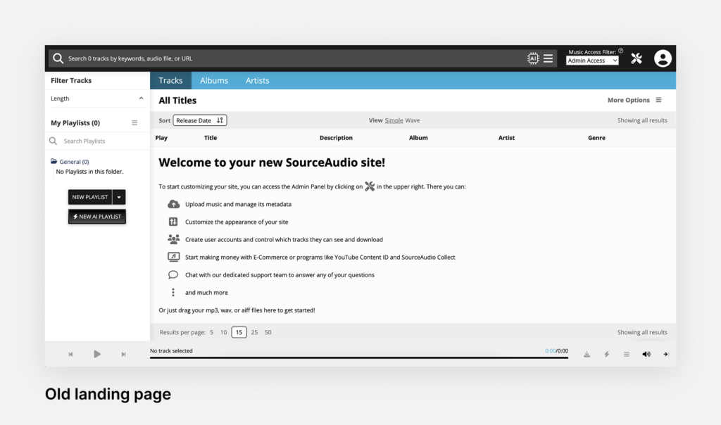
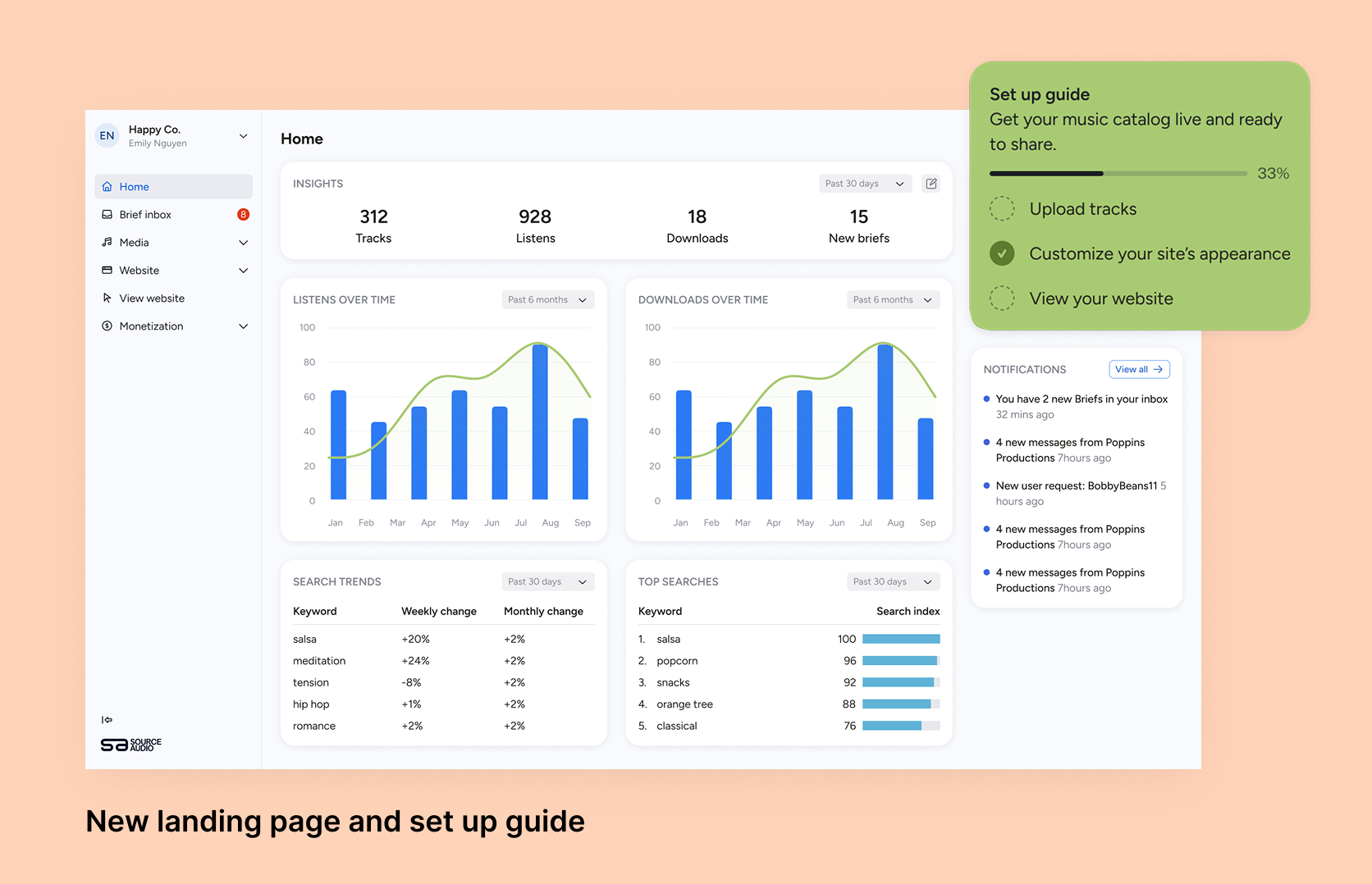
Problem 1: First time users landed on an unexpected page
Good UX design leans on familiar patterns so users can orient themselves quickly, even in a new tool. When a new admin logged into SourceAudio for the first time, they were met with an empty tracklist and a bloated welcome message telling them what to do next. It didn’t resemble the kind of dashboard experience users expect from modern SaaS products, and to find admin tools, they needed an additional click to get to the admin portal.
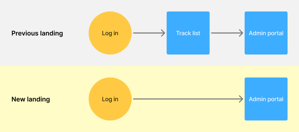
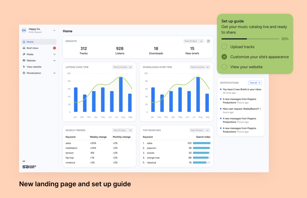
The fix:
For a content management platform like SourceAudio, the right entry point is an overview dashboard that communicates key information. A green modal with heavier visual weight draws the eye and gives new users a clear place to begin.
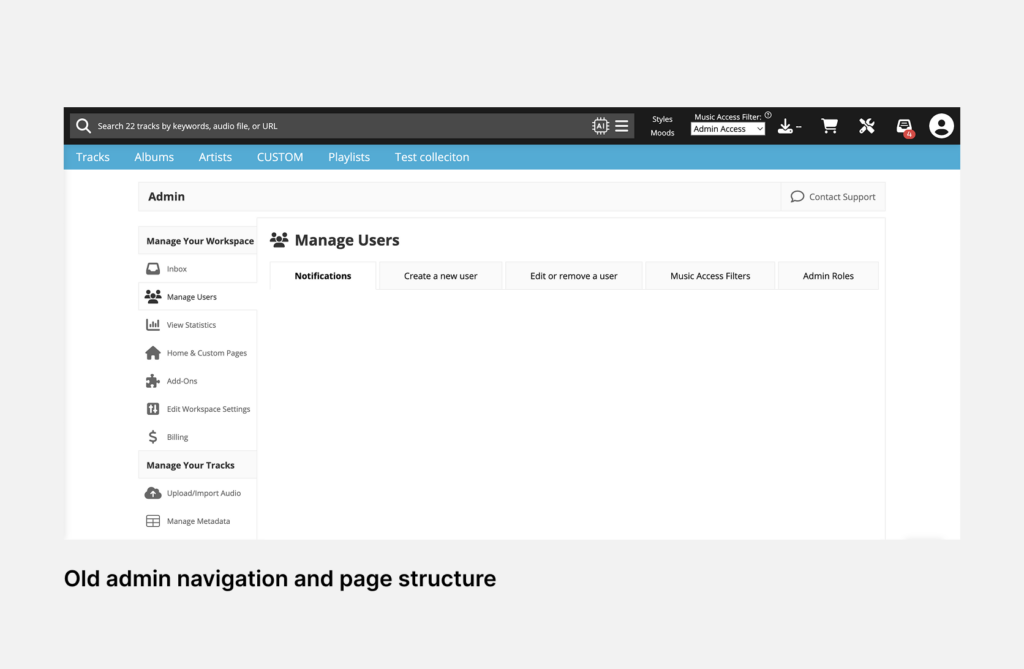
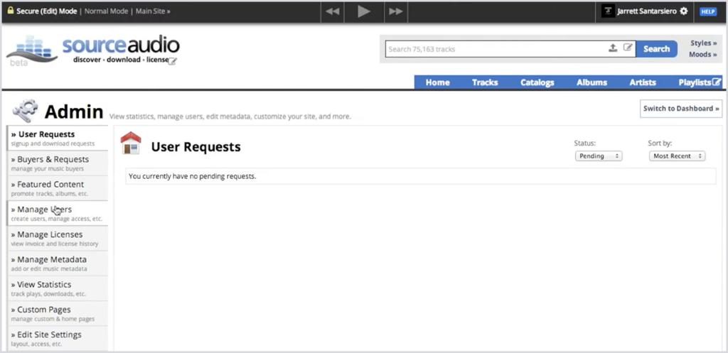
Problem 2: The navigation hierarchy was confusing and admin tools were not at the forefront
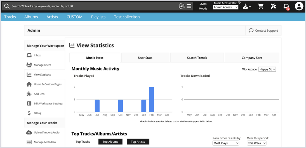
SourceAudio has always had a broad, capable feature set, but a feature no one can find might as well not exist. In the old design, the top-level navigation items were related to viewing tracks instead of showing the breadth of tools available for admins. It’s likely that adoption of certain features has suffered because of it. Furthermore, on the admin panel, the placement of the admin navigation made it seem like admin tools were a sub-function of the library pages, when the reverse is true.
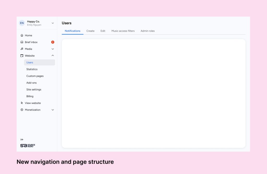
The fix:
The first navigation bar that admins see is one containing admin tools, rather than library navigation. This is a more sensible hierarchy, as catalog management is just one of many tasks that an admin might want to achieve when logging into SourceAudio.
The fixed vertical navigation is similar to other Saas products and provides the user with constant feedback about where they are in their workspace.
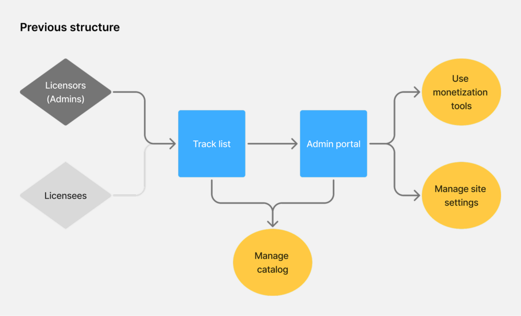
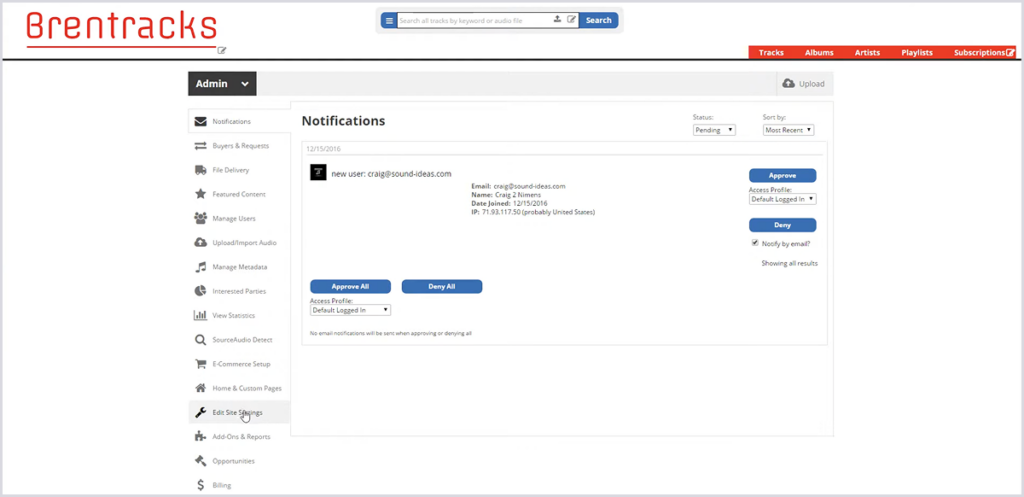
Problem 3: Admins and end-users were sharing the same space
SourceAudio is a two-sided platform- on one side are licensors and on the other side are licensees. These two groups have fundamentally different needs, but they were navigating the same UI with different permissions. For admins, this meant a cluttered, noisy experience full of elements that weren’t meant for them.
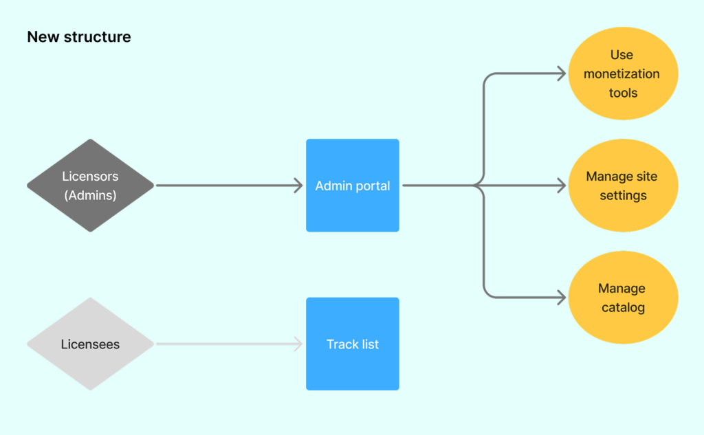
The fix:
Licensors now have an admin portal that is clearly distinct from the end-user track view with none of the visual noise of the licensee-facing interface.
Moving forward
While all of these changes are coming alongside a significant cosmetic update, it’s more than just a shiny new UI. I’m addressing fundamental problems that made SourceAudio confusing to new users, or even to experienced ones trying to find a specific tool. Updating the admin experience with modern design patterns and more intuitive structure should make SourceAudio feel like a product people already know how to use.
SourceAudio’s feature set is extensive, and improving the information architecture is an ongoing process. This update will make the product easier to adopt, easier to explore, and easier to grow with over time!
YouTube Shorts monetization is now live. Here's what else is new in June.
June was a build-heavy month across our licensing, YouTube, and Collect businesses. We launched a major upgrade to our music-monitoring service, invested in faster and more accurate royalty processing, moved several enterprise integrations...[ READ MORE ]

The operational side of maximizing catalog revenue
One of the clearest indicators of long-term catalog health is whether there’s a real system of record behind it. By that we mean: a single place where the rest of the business can quickly confirm what a work is, who owns it, what iden...[ READ MORE ]
May at a Glance: A Product Update, the Brief Inbox, and a New AI Podcast
The Brief Inbox didn't slow down in May, and neither did we. Column customization shipped, and Drew made an appearance on Morning Brew's new AI podcast to talk music and AI. Drew on The Intelligence Shift Drew Silverstein, our Presid...[ READ MORE ]
Why Brands Are Moving Toward Aggregator-Driven Music Licensing
The way music gets licensed for advertising is changing at the infrastructure level. More brands and agencies are moving toward aggregator-driven ecosystems, where platforms like SourceAudio plug directly into proprietary music discover...[ READ MORE ]

April Recap: Luminate Summit, Blog Post, and What's Coming Through the Brief Inbox
Andrew Talks AI Training Data at Luminate Summit On April 15, SourceAudio CEO and co-founder Andrew Harding joined Doug Shapiro, Dave Davis, Dustin Blank, and Matthew Adell on "The AI Training Data Economy" panel at the Luminate Dat...[ READ MORE ]
Fixing Foundations: How I restructured SourceAudio to be more intuitive for admins, new and old
For over a decade, SourceAudio has been adding features, expanding its reach, and growing alongside the music licensing industry. While our toolset has proven valuable to our client base, it’s important to acknowledge weaknesses that hav...[ READ MORE ]
February Updates: Symphonic Partnership, Best Audio Brands & Product News
SourceAudio x Symphonic We're excited to announce a new partnership with Symphonic Distribution. Symphonic artists and labels can now opt into SourceAudio's AI music dataset licensing marketplace, opening up a new revenue stream ...[ READ MORE ]